
The Art of Neutral Tones
When thinking about designing your new space, colour has a key part to play but it can often be the trickiest, with different facing gardens and interior lighting having an effect on the overall feel of your space.
Neutral tones are a popular choice as they are timeless and you can effortlessly add colour with décor items making them a perfect foundation. Here are a few things to consider when choosing neutral colours for your new interiors.
Types of Light and Tones
North Facing or South Facing
The general rule is this, if you have a north facing room but you want to avoid your space feeling too cold then you should consider warmer tones, if you have a south facing room but want to avoid your space appearing to yellow or orange than consider cooler tones.
It is all a balancing act, by following the combinations above you will achieve a space that appears more neutral. But here is the catch, light changes all the time and so does the weather, especially in the UK, so throughout the day or a week you could see all manner of tones and shades in one room! This is where artificial light can help.

Lighting is Key
Artificial lighting can play a huge role in transforming your space. We are big advocates for adding feature lighting where possible as it can really change the feel of a space and that is how we connect with the rooms we are in.
When choosing lighting for your space, again think about the tones that natural light gives you. South facing, try natural white to balance out the warmer tones, if you are north facing, try warm white to balance the cooler tones. If this sounds a bit too much to think about, then don’t worry, there are solutions where you can easily adjust the temperature of your lighting with one system.
By thoughtfully considering your artificial lighting, this will help with any natural lighting issues you may face with our wonderful weather changes!

Colours to Create Atmosphere
When we think of neutrals, the choices are generally cool, warm and somewhere in between. Each of these tones give off their very own atmosphere. I have put together three mood boards showcasing this. Which of these do you feel most drawn to?
Cool, Soft & Warm
When I think of cool tones I see misty mornings or industrial buildings. Warm tones, I think autumnal sunsets or a glass of red wine by the fire. Soft tones, I think of a coastal home along the Norfolk beach.

Each tone can tell its own story and make you feel a certain way. The same goes when applying colour to the spaces in your home. As I mentioned neutral tones are a great foundation to adding other colours and personality to your spaces. Let me take you through some colours that compliment each tone and translate this into something we all understand, Farrow and Ball! You can take these boards as inspiration and apply them to your furniture colours, painted walls or décor items. I encourage you to mix and match different depths of colour, for example if you are using a lighter green on your walls, opt for a dark green for your bar stools or kitchen island.
Complimentary Colours
Cool Tones

Cool tones in interior spaces typically refer to colours that evoke a calm, refreshing, and serene atmosphere. Each colour used to compliment this mood board has a cool undertone. Both pastel or high contrast colours go very well with a cool palette such as lavender and dusky pinks. If you are using a cool colour palette to balance out a warm space consider some of the paint options illustrated.
Paint Palette
Calluna
Hague Blue
Sulking Room Pink
China Green
Green Smoke
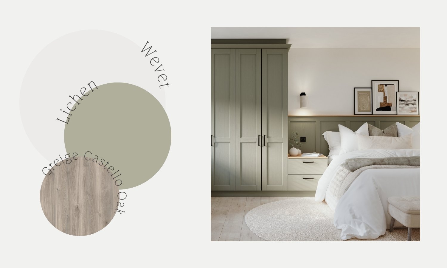
Lichen
Warm Tones

Warm toned colours in interior spaces are hues that evoke a cosy, inviting, and comfortable atmosphere. These complimentary colours have warn undertones. Colours like terracotta, olive greens and berry reds work wonderfully with warm spaces.
Paint Palette
Etruscan Red
Naperon
Marmelo
Reduced Green
Dibber
Duster

Soft Tones

Soft tones are somewhere in-between cool and warm, combining soft and cool colours in the same space will achieve a calming but cosy atmosphere. You can achieve this look by combining warmer tones of white for walls and cooler greens for an accent colour, or shades of pastel blue or green with soft stones and whites.
Paint Palette
Cardamom
Wevet
Marmelo
Jitney
Teresa’s Green
Drop Cloth

Final Thoughts
I hope this helps you visualise how you would like your space to feel with a better understanding for lighting and colour tones. I always recommend thinking outside the box a little when finding inspiration for your new space. Don’t just look at bedroom pictures if you are designing a bedroom, inspiration can be found anywhere, like a place you’ve visited. Create mood boards on Pinterest of any images that speak to you with certain colour tones. We will be able to use our tools to pull colours from these images and find a colour match for you.
Leave a comment telling us which colour tone speaks to you!